Skip to content
AaronKGumbs
Author:
AaronKGumbs
Using Generative AI for Requirements Discovery
Productivity
,
Project Delivery
Configure Better URLs for Power Apps
Dynamics 365
,
Model-Driven Apps
,
Power Apps
,
Power Platform
,
The Microsoft Cloud
I broke my elbow, but technology kept me going!
Productivity
,
Project Delivery
,
The Microsoft Cloud
How should I access my personal productivity solutions?
Canvas Apps
,
Model-Driven Apps
,
Power Apps
,
Power Automate
,
Power BI
,
Power Platform
,
Productivity
,
The Microsoft Cloud
Automate Reminders for your ‘Rhythm of Business’ Schedule
Power Apps
,
Power Automate
,
Power Platform
,
Productivity
,
Project Delivery
,
SharePoint
,
The Microsoft Cloud
Visualise your Microsoft To Do Items in a Calendar View in Canvas Apps (Part 2)
The Microsoft Cloud
Visualise your Microsoft To Do Items in a Calendar View in Canvas Apps (Part 1)
Canvas Apps
,
Power Apps
,
Power Platform
,
Productivity
,
The Microsoft Cloud
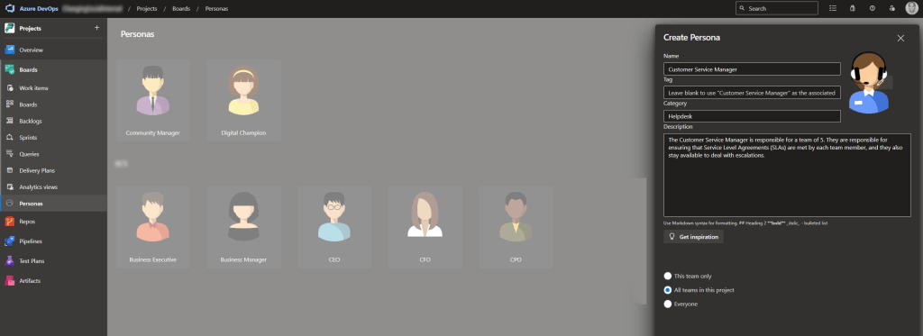
Personas in Azure DevOps
Productivity
,
Project Delivery
,
The Microsoft Cloud
1
2
3
…
5
Next Page
Subscribe
Subscribed
AaronKGumbs
Sign me up
Already have a WordPress.com account?
Log in now.
AaronKGumbs
Subscribe
Subscribed
Sign up
Log in
Report this content
View site in Reader
Manage subscriptions
Collapse this bar


 AaronKGumbs