
To catch up on where we left off in my last blog post, check out part 1 on how to set up your Canvas App with the correct data model that this blog post enhances.
In the first part of this theme we ended with a working set of notifications that could be displayed within the Canvas App using a Dataverse table, however, I decided to leave the cosmetics until part 2 so that I could deliver something unique. Here’s what the Notification area looked like when we finished part 1:

Let’s take a look at three UI enhancements that we can make for the user to improve their experience, and to bring alerts to their attention!
1. Make the Notifications Gallery Distinctive
Gradients, rounded corners, white space, and minimalist designs are the latest go-to trend in software design – and for good reason too! Using these tricks helps you to focus the user’s mind on to a specific area of the app without overwhelming the user with too much information, whilst other components seem to blend in to the container that the content sits within.
At the time of writing, rounded corners aren’t available in every control and gradients just simply aren’t possible. However, for those of you that are comfortable with inserting CSS through templated means, you’ll be pleased to know that you can use the ‘Html Text’ generate these designs for you.
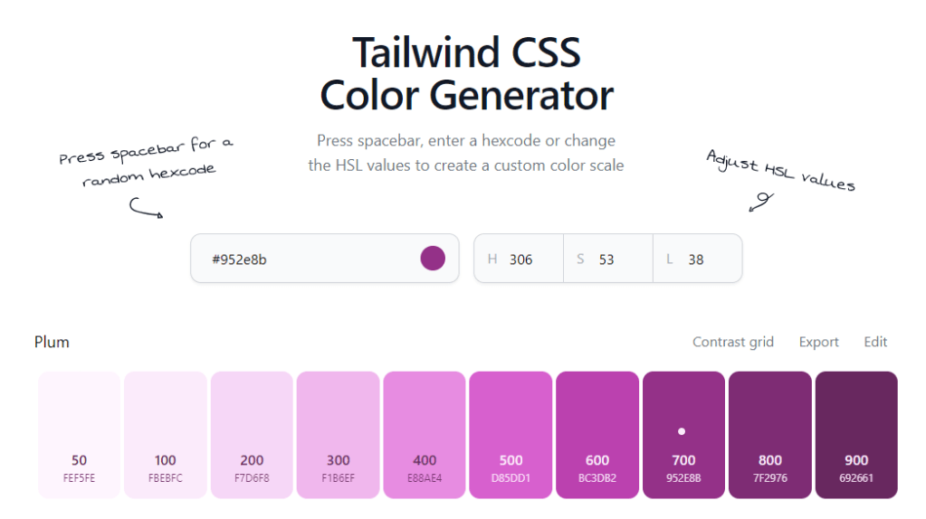
First of all, we need to choose a colour palette. If you don’t have any experience in working with colours then you can use a combination of the Power Toys’ Colour Picker and/or this Tailwind Colour Generator to create gorgeous modern designs.
Keeping the app on-trend, here are my colour palette options in Power Toys:

And here is the same colour with its colour palette in the Tailwind Colour Generator:
To incorporate these into our app, we need to add the new Html Text Control to the screen and we can use a simple snippet of HTML that wraps around our CSS with our chosen styles. The snippet you’ll need is:
"<div style=""border-radius: 15px; background-image: linear-gradient(#952e8b, #692661); width:100%;height:" & HtmlBg.Height -11
&"px;""></div>"- <div> acts as the ‘block’ that we want to design.
- border-radius allows us to add rounded corners.
- background-image allows us to specify our gradient, and lastly,
- width & height specifies the size of our ‘block’.
Whilst building this I realised that I was seeing a vertical scroll bar on my <div>, so by calculating the height as ‘height of the Html Text Control – 11’ we can make our <div> small enough to fit within the Control and therefore remove the scrollbar.

Your screen will now look something like the above, so just remember to right-click on your Html Text Control, navigate to Reorder, and choose Send to back.
2. Adjust the Fonts
Your Notification Gallery will now look far better than before but depending on the colours you have selected for your gradient, it’s unlikely that your text will be visible to the vast majority of individuals, and you may receive accessibility warnings in your App Checker.
Set your Labels’ colour to white (or RGBA(255,255,255,1) for the technical amongst us!), and use bold and underline formatting to make elements of your Notifications panel stand out.
For my example, I have:
- Set the ‘Notifications:’ Label to size 18px and bold.
- Set the ‘Date’ Label to size 14 and underlined.
- Adjusted the main body of the notification text so that the modern Navigation controls fit nicely against the title and footer of the Notifications without taking up too much space.

3. Visualise Information
If you remember from part 1, we had even more information that we wanted to display in this notification panel. We created a Type field that allowed us to specify the severity of the notification. Our objective is to keep this design clean, so instead of adding a Label with the type, perhaps we could provide a circle that shows the severity.
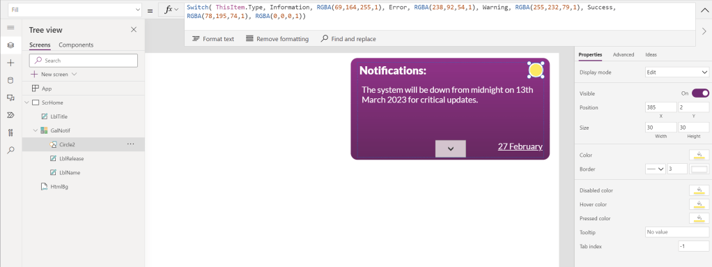
To do this, we need to add a Circle Control to the Gallery Control and our Fill Property is going to be controlled using the Switch Function, which allows us to provide different results based on a series of potential outputs.
Use the following snippet with some well selected colours using Power Toys’ Colour picker again, and each Circle within the Gallery will have a different colour based on its severity, or it’ll be filled white for anything else.
Switch( ThisItem.Type, Type.Information, RGBA(69,164,255,1), Type.Error, RGBA(238,92,54,1), Type.Warning, RGBA(255,232,79,1), Type.Success, RGBA(78,195,74,1), RGBA(255,255,255,1))To make sure that our colours remain accessible, adding a border to the Circle Control also enhances the look & feel. The end result should look something like this:
Conclusion
We’ve now completed our fully styled Notification panel that can be used alongside other Controls in our app! You may want to make some adjustments to your final output, and thankfully this is extremely easy to do using the Properties within your app or further CSS within your Html Text Control, you just need to spend some time testing out what works for you and your company’s brand/style.
If this article helps you and you manage to create something new, please feel free to share your creations in the comments!

 AaronKGumbs