One of the phrases I hear so often is “when would I ever use algebra in real life?!” – Well here is your answer.
Today I came across a very interesting challenge whilst trying to build a Sales Pipeline graphic in Canvas Apps. I could easily ensure that the widths of my bars were dynamic, but trying to find the mid-point of any given bar to centre the graphic dynamically was initially tricky!
The Theory
To get started, we need to understand several positions of controls within our app which I have demonstrated for you below:
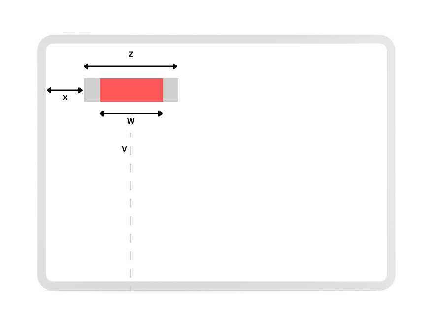
- V – The desired centre point of all bars.
- W – The width of the bar that dynamically changes based on the value assigned.
- X – The position of the background from the left-edge of the screen.
- Y – The position of the control from the top-edge of the screen. It is not shown here for clarity as this isn’t used in any upcoming calculations.
- Z – The width of the background.
At this point in time we can define some of the above. These can be whatever you want them to be, as long as you continue to use the same values throughout this blog post.
- W – 0px to 500px
- X – 95px
- Y – 100px
- Z – 500px
Initial Set Up of a Bar
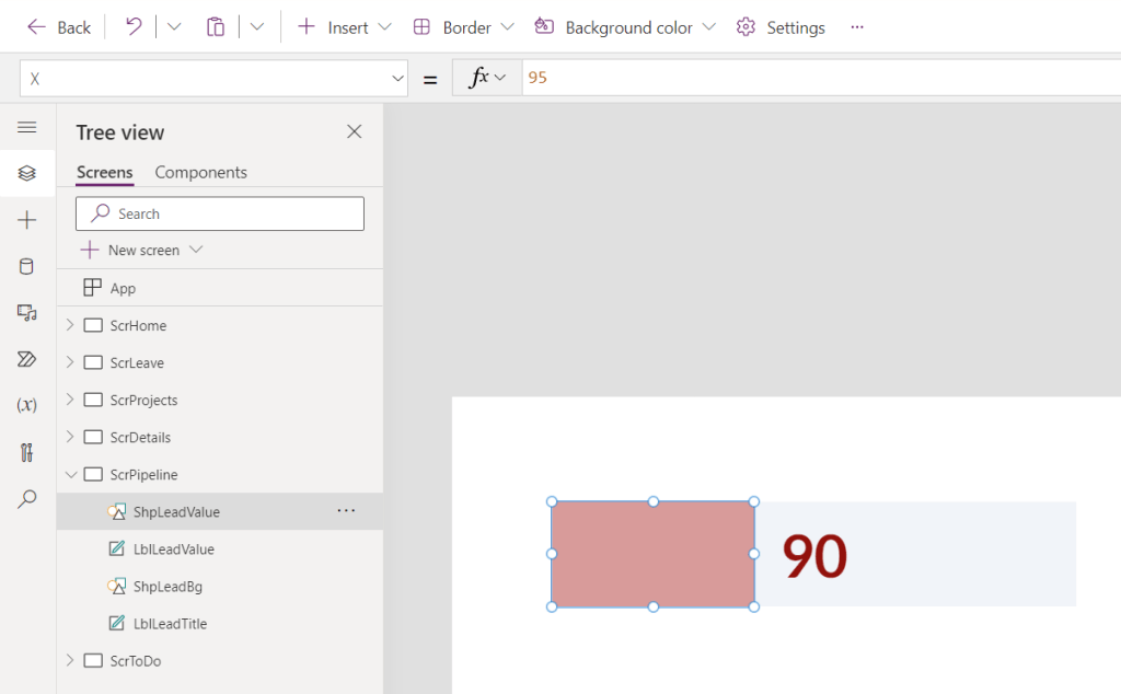
To get us started, we need a numeric value for the bar. In my actual work today I used filtered Collections in order to obtain the values dynamically, but for this example I have simply set my Text labels to the static values 90, 47, 33, 10, and 20 for confidentiality and for clarity on the purpose of this article. Set this Text Label to a large font with a dark colour.

Add two new Rectangle controls to the Canvas and give one a light shade to indicate the bar’s background, and the other a much bolder colour in order to indicate bar’s value.

Set the X property of the background shape to 95 (X) and the Y property to 100 (Y). At this point you can right click on the Label control for the bar, Bring to Front, and place it in the centre using drag-and-drop. It’ll snap into place!

At this point you can also select the control for the bar’s value and set the Y property to 100 (Y).
Calculating the Remaining Values
By using the currently known values, we can calculate the width (W) and the X position (X) for the bar’s value using Power Fx.
In this example I wanted my bars in my sales pipeline to take up a maximum of 500px. If the value was under 50 I’d dynamically change the bar, but if it is 50+ then I want the bar to be the maximum width. This ensures that at realistic values my bar always shows a relative scale, and anything else considered extreme wouldn’t take up too much of my Canvas App’s screen.
If(Value(LblLeadValue.Text) <50, LblLeadValue*10, 500)
The next part was the most difficult to work out and I had to go back to pen & paper to draw the diagram shown at the top of this article.
To calculate the vertical centre point (V) so that all bars align, we need to:
- Take the chosen position from the left edge, X.
- Add the maximum width of the bar, W.
- Divide the maximum width of W by 2, W/2.
- Subtract the above.
- Divide the width of Z by 2, Z/2.
- Subtract the above.
V = X + W – (W/2) – (Z/2)
V = 95 + 500 – (500/2) – (Z/2)
As everything up until point 5 is predictable and static, for simplicity in my Power FX I didn’t write the formulaic version until we got to step 5.
345-(ShpLeadValue.Width/2)
And there we have it! One bar with a dynamically changing X position that always ensures alignment with additional bars.
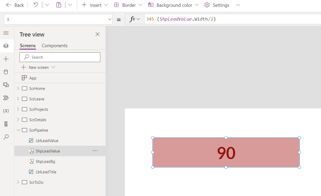
Note that the bar has intentionally not changed since the last screenshot.
Next Steps
The final stage is to simply duplicate this group of controls, add some labels for the bars, and then ever so slightly adjust the two formulars on each of the bar value controls so that each width aligns to the correct label.
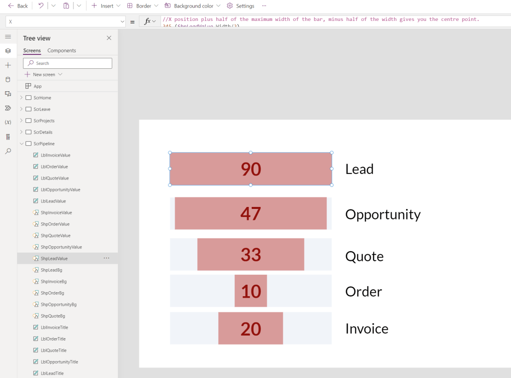
This could also be improved in many ways. If your values sit in a Collection with your labels then you could create each bar as a gallery to remove the burden of duplicating controls. You could also re-position and re-colour the label showing the bar’s value depending on the width of the bar itself.
 AaronKGumbs