Just over a week ago, we looked at how we could deliver a calendar-style view to display To Do items, and the reason for the post was because I never knew how complex building a calendar might be! Here’s how I decided to style my view to give the end user some visual indicators to where To Do Items actually land.
Calendar
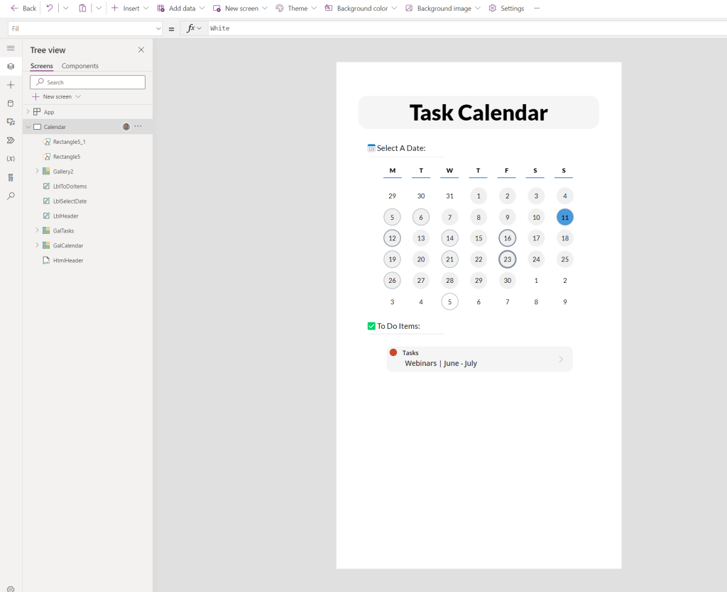
At the end of part one, our calendar simply looked like a block of numbers on the screen. We can turn this into a calendar by adding a Day indicator, and several indicators for the end user who is selecting the date to see filtered To Do items.
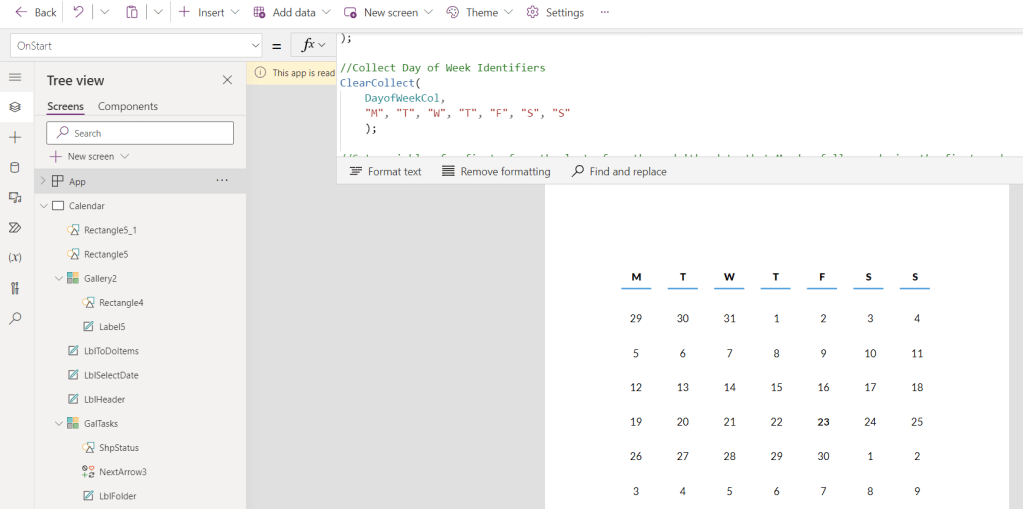
Within this example I decided to use a new Gallery with 7 items and gave the Gallery itself the same X position as my calendar Gallery, and the Items the same width so that everything aligns. Personally, I prefer to use the ClearCollect function on the OnStart Property of my application even for trivial lists of data such as these just in case I want to re-use them in the future.
ClearCollect(
    DayofWeekCol,
    "M", "T", "W", "T", "F", "S", "S"
    );
Next up, we should add a visual cue to the end user that helps them to see where it’s possible to click or tap in order to select a date. By adding a Circle control to the Gallery Item, we can conditionally fill the circle based on whether the item is in this month and whether the item is selected. This will also visually indicate to the user how their To Do Items are filtered.
At this point, our ‘LbLMonth’ control becomes extremely important. In the last blog post we set this control to store ‘Last Month’, ‘This Month’ or ‘Next Month’. In our Power Fx for the Fill Property, we’ll check if the item is selected (as we want to indicate this regardless of month), and then use ‘This Month’ in further logic before displaying the correct Fill colour.
If(ThisItem.IsSelected, RGBA(61,155,223,1), If(LblMonth.Text = "ThisMonth", RGBA(240,240,240,1), RGBA(0,0,0,0)))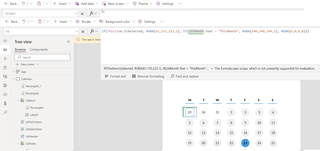
Quantity Indicators
Although Outlook on the mobile provides an indicator of which days have meetings, I feel that there is a missed opportunity to show intensity! We can use the Controls developed in part 1 to identify how many items are available for any given day, and then show a visual change based on how high that number is.
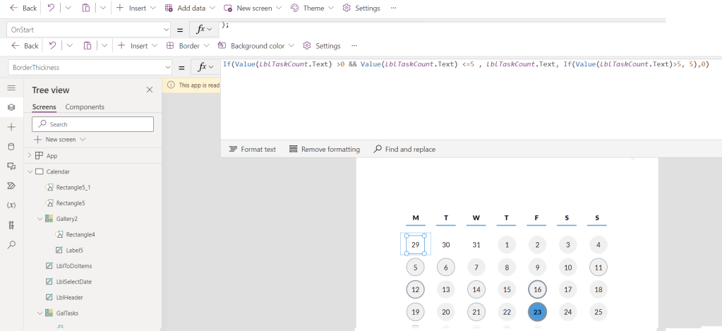
By using the following code, we set the Border Thickness +1 pixel per To Do item, but once we go beyond 5 items, we stop increasing the thickness.
If(Value(LblTaskCount.Text) >0 && Value(LblTaskCount.Text) <=5 , LblTaskCount.Text, If(Value(LblTaskCount.Text)>5, 5),0)
I didn’t want my app to be too colourful, but you could set the rings to change colour based on quantity too!
To Do Items
In the previous post we simply changed the Label controls for text that was more meaningful, but we didn’t do anything to add any more visual value to the data being presented. By simply checking the To Do Item’s status and setting a control on the screen based upon this, we can quickly tell the end user what’s outstanding and what’s not.
I opted for a Circle control (again!), and chose red and green as the Fill Property’s options based on ‘Not Started’ and ‘Complete’ respectively.
If(ThisItem.Status = "NotStarted", RGBA(210,62,37,1), RGBA(46,178,117,1))
(The emojis are a part of my list name as opposed to being part of the Gallery’s template)
Finishing Touches
Last but not least, I’ve taken some styling cues from previous blog posts to create a very simple app header and some titles to indicate what each part of the screen is showing. These simply use Html Text and Label Controls in order to meet this app’s needs.
Next Steps
And there you have it! Now this app is by no means complete, there are still several requirements that I plan to implement but they are so specific to my own personal use case that I felt that documenting them may not add the value that I’d hope, unless there is a request of course! Here are some suggestions to spark some ideas that you could deliver using this baseline:
- Utilise the arrow on the To Do Item Gallery to show you a full view of any given To Do Item. I plan to replace this with quick actions to mark an item as complete as it’s the only thing that I need from this view, but this may not suit everyone.
- Show/hide the first or last line of the calendar based on whether there is a date within ‘this month’ in the row. This is something that I am undecided on as it makes sense for most calendars but I like the rolling view of dates as it stands.
- Integrate with Microsoft Outlook to include Calendar items using this blog post, and then you really will have a true Sunrise replacement!
 AaronKGumbs